I too prefer IIIOO’s simpler approach.
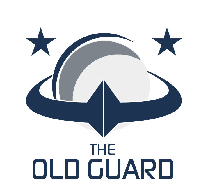
Something different, now. A kind of planetary shield or something :]
8 Likes
This I like very very much…
While I like the use of the OG, #7 doesn’t really sit well with me. My overall favorite of your designs so far is actually from your first batch, middle black one. Simple, ‘shieldlike’, good use of the loop, and I love the font (reminds me of Skyrim). It’s got hints of age, but stays crisp and modern.
I also like that you aren’t coloring them, maybe you will later but if a logo cant work well in black and white then its probably too complex.
I feel that OG sounds better than TOG. Like if it was used in a sentence.
Ps:
Some awesome work that you guys have done. I wouldn’t be able to choose if it was up to me to pick one, they are all so good, well done, keep them coming, cant wait to see more. What ever one dose get chosen I know that I will not bedisappointe
I doubt we will be making Roll ups, business cards or brochures as part of a corporate Identity for OG so I figured I should suggest some actual items in addition to the logo and/or crest that could be made.
.
- Header graphic to be used in the OG thread (690x300px)
The first post graphic. Contains the name of the group, the logo / the crest and some graphical elements.
- Heading graphic (690x80px)
Since we might not be too concerned about SEO I thought it would be cool to make some graphical headings in the OG thread. So put in some graphical elements and some Lorem ipsum filler text written in your chosen font.
- Profile background image (1700x620px)
The default size for the profile bg image is 850x310px. But since the image is going to be scaled bigger as you view the site from certain screen sizes I would suggest doubling the dimensions. Hence 1700x620. Note! The light grey info bar on the bottom will overlap with the image.
- User card background image (580x232px)
The user card bg image does not change it’s size. It will always appear in the size of 590x236px (it is said to be 590px wide in profile preferences but I measured only 580px).
- Optional tag for regular profile bg images (280x175px)
If you use the before mentioned size for the profile bg image then there is a safe area of roughly 180x175px in the upper middle part of the image. This area will retain decent margins around it no matter what device you are using to view the page:

I made templates for the profile background image and the user card image that has all the profile elements like username and profile image on their own layers on top of the image. I think it’s useful to know where these elements will be so that you won’t place any important detail below them:


.
You can get the template for the profile background image and the user card image here:
6.Graphical guidelines
A small guide with the chosen colors, typography and different ways the logo can be used etc. This doesn’t have to be too extensive. Just the basics.
5 Likes
Here’s an attempt on the profile bg image.
Note! This is not the tag on a regular bg image but an actual OG background with the OG logo.

And a with some scaling of the browser window:


Edit: Not sure about the top line…
Edit2: I don’t like how most of the continents are blocked by the dark area. Perhaps just have the planet horizon there without the continents like in the crest?
4 Likes
I would add gradients and 3 dimensions (basically push the shapes out of the background) to it to make it really pop in the right spots.
Still sticking with flat design mostly. But I have experimented with some subtle effects.
A simplified version:

OR
A more detailed version but without the top line as well:

(I just remembered that I can use the elements on the template so I don’t need to take a screenshot of the bg image in place  )
)
EDIT:
Leaning towards the complex one now that the pillars got more detail and the top line is gone.
P.S. You can test it out here and see how it works in various screen sizes by squeezing the browser window. Imo pretty well
1 Like
A lot of good things here, keep it up ! 
I like the earth continents in the circle.
The User Card bg:

It was 590px wide after all, although it’s displayed in 580… Gotta change the template too.
I suggest moving the deadline with one more month. With the purpose of perhaps getting more people to design more than just the logo part of the competition.
(accidentally posted this into the OG thread… and now it doesn’t let me post it here without some filler text)…
I rather have us decide what logo should be selected (e.g the winner of this) and then have that person flash out the rest instead of everyone having to advance to that level.
O jeah and I didn’t forget (xcept last weekend … when I did) this. My entry will come.
1 Like
Well… what if that person loses interest or lacks time after designing the logo? Finishing the package into a usable asset set for the future use of OG should be considered as an important factor when deciding who to vote. At least it will affect my vote.
This is after all a competition for a complete graphical identity. I would hope to see the participants offer their vision of the whole package. And voters would choose between those complete packages. Of course participants might have a different vision of what that package consists of (just a logo and a few heading graphics or a complicated package with dozens of different items).
I understand the point of trying to minimize “unnecessary work”, but hopefully participants will enjoy the process even if their set won’t be selected in the end.
Looking forward to see your entry 
Maybe we get another winner by default, great work Lucas, you got my vote so far.
I will extend the deadline to May.
Status update… I decided to go with the last ‘owl’ design as the final design. Tuned it and made two 3d versions.
Colours will be added only in the final submission The’heart’ shape on the 2nd version came out by accident and I like it quit a lot as it could represents us, the community members who love this project!

16 Likes
I’ll have another look at it soon. Just had a change in worklife, so not much time anymore to do other things in the office anymore :]