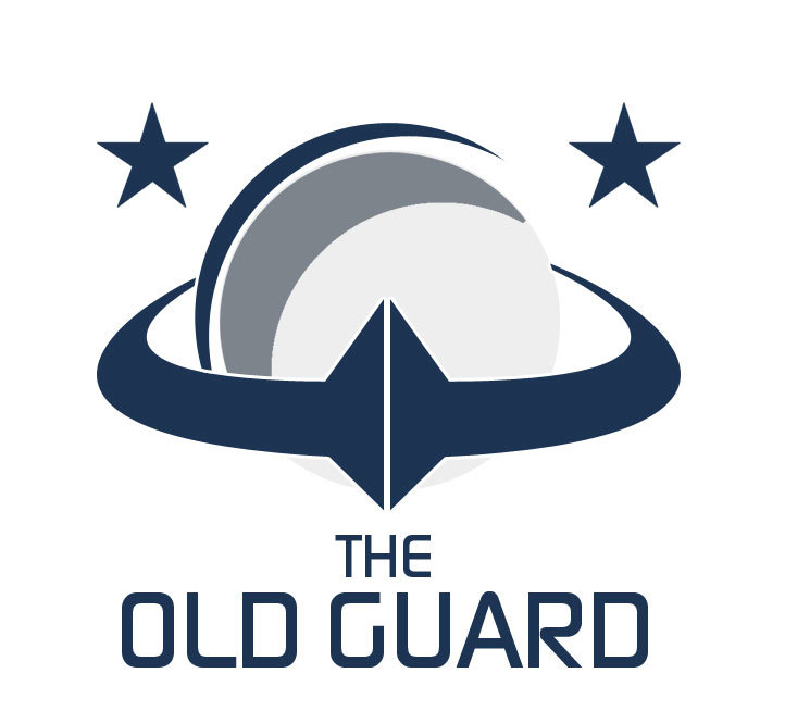
I feel his design is clear and cohesive and the aesthetic style is modern and suitable for the sci-fi genre.
However, it was a difficult decision because I really appreciate the iconography (is that the right word?) in @LucasFIN’s of the Flamberge as well as the forum pillars.
One reason @LucasFIN’s doesn’t get my vote is that I feel there were too many elements (including some which I felt superfluous like the wings and stars) and I don’t think they all come together as a single cohesive design.
I especially appreciated @LucasFIN’s brand guide document.
I think the plain variant of @IllOO’s design is a bit sparse, but ultimately I think simplicity is preferable to too busy.
Finally, thank you both for the time you put into your submissions as well as everyone else who had a go but decided not to submit their work for consideration.
Remember to bold your votes to make it easier to count the votes later
My own vote goes to IIIOO. I really like the dark theme and I wish it will be used as the main theme if selected. The light theme would fit well in profile background images imo (more contrast with the dark info bar).
I really like the shield variant of the logo. The plain OG without the shield looks a bit odd though. Perhaps it would work better outside the shield without that center ridgeline type of thing behind the letters OG? So basically just the letters OG on their own. Or if it was more clear that it’s a heart shape (without the top spike between the O and G).
All in all the style of the pack is very fitting for a sci-fi setting. Perhaps the oldness should be more pronounced in more than just being in the name, but maybe a modern design by our standards is something ancient for the people in the Infinity universe
Good work IIIOO! And thanks for all who participated.
While I’m a huge fan of the inclusion of the Flamberge (see my early submission, btw very disappointed not to be an option for voting :P), I also quite like the OG/∞/ combo, so the deciding factor becomes one of the things I consider most important in digital logos:
Can they be scaled up and down without losing what makes them them?
Well, both have been submitted at the largest resolution likely to be needed and I assume scaling them up is something you can easily do, but as for down:
I really like LucasFIN’S design. They high level of detail with the color scheme immediately creates an antique like feeling which is very fitting for the Old Guard.
However I also believe that simplicity wins out in this case: IllOO’s design is very clean and poignant, and can easily be integrated onto ships later (if we get decals) no matter how they look. Plus I also really like the blending of the OG with the Infinity symbol.
So my vote also goes to @IllOO, but LucasFIN gets my honorable mentions.
Tough choice, both designs are great. My vote will go for @IllOO by a small margin, though, on the basis of purely a gut feeling.
Congratulations for both of you, though!
Thanks for the tip on how to edit an old post past the 6 months limit @hrobertson. I am assuming your fix will only allow you to edit the thread once.
But the thing is I have to edit this post every time a new challenge is initiated. And I need to edit the OG thread every now and then for new members, new graphics or announcements etc. I suspect many more threads will suffer from this feature once they hit 6 months in age.
What is the reasoning behind this limit by the way?
For the art challenges I suggest you create new threads for each one. That allows discussion and comments relating to previous challenges to continue without having multiple conversations going on in one thread.
Keeping it as one thread enables using the first post as a summary, but I don’t know how useful that actually is?
I’ve had a search on meta.discourse.org and while it has been suggested several times, a longer edit window for TL3 doesn’t look likely.
Im protesting with a vote for this, screw all the rest of you lot, you can take your official competition and feed it to an anteater! damnit @BenThuro, why must you tease with such a great design.
ok ok, i will relent. Ill have to vote for @IIIOO for the simple elegance of it, lucas’ is certainly elegant but its also a lot more complex, especially with those those pillars
I have to vote for @IllOO 's design, mainly because that shield is begging to be printed in metal, given a black painted patina finish and rub… and then fitted with a broach pin on the back. That’s my reasoning.


 combo, so the deciding factor becomes one of the things I consider most important in digital logos:
 vs.
vs.  /
/  /
/